Blindness and Universal Design
Universal design, creating interfaces that work for the broadest range of users, requires starting with awareness of accessibility: adaptable structures and formats must be an integral part of initial patterns. Experience demonstrates that a retrofit ("Let's fix this old site so that people with disabilities can use it") rarely works well.
And, user-centric design dictates that architects enter the world of the end user.
That does not mean evaluating prototypes with synthetic speech, but it suggests that an
awareness of text equivalents and keyboard shortcuts should inform design from the earliest stages.
Sub pages of this section are intended to assist people new to universal design to appreciate what web pages
look like,
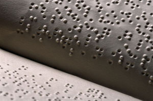
sound like, and feel like.
the Desktop metaphor
...another view
When looking at a computer screen, what are we seeing? What is information, what is a desktop metaphorical structure?
 |
In the structural world of Information Architecture, complex treatments of information are removed. When designs are done in wireframe mode, the basic elements of navigation and context are essentially text. Images can be easily represented by an equivalent text description.
Natural Transformations
content in dynamic views
Using a format neutral mode as the form into which more complex designs can "degrade" enables pages to transform more easily into a linear structure.
And, of course, many pages designed for a large screen may need to transform for another "disability" - the mobile user's smaller screen.


